APCA vs WCAG 2: Why the New Contrast Standard Changes Text Legibility
WCAG 2.1 contrast math has a major blind spot: it ignores font weight and treats dark mode identically to light mode. Here is how APCA fixes text readability.
If you have ever designed a dark mode interface, you have run into the infamous WCAG 2 contrast trap.
You pick a bold white headline on a dark slate background, and WCAG tells you it passes with an astronomical 15:1 ratio. Then you test pure orange or bright cyan text on dark gray; it passes the 4.5:1 threshold easily, yet real human eyes struggle to read it because of chromatic aberration and visual glare.
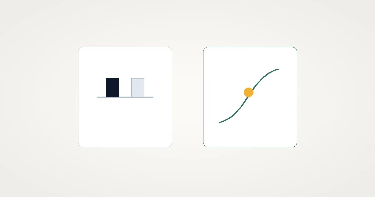
The quick answer is: WCAG 2 uses a purely mathematical ratio of relative luminance. APCA (the Advanced Perceptual Contrast Algorithm) models human spatial vision, taking into account font weight, character size, and background polarity.
You can test any color pair against live accessibility thresholds with our contrast checker.
Here is why WCAG 2 math breaks down, and how APCA is reshaping modern accessibility.
The mathematical flaw in WCAG 2
WCAG 2 calculates contrast using a simple formula:
$$\text{Contrast Ratio} = \frac{L_1 + 0.05}{L_2 + 0.05}$$
Where $L_1$ is the relative luminance of the lighter color and $L_2$ is the darker color.
This formula has three fatal design blind spots:
1. It is mathematically symmetric
The formula treats light text on a dark background identically to dark text on a light background.
Human biology does not work that way. In dark mode, light text radiates outward into neighboring retinal photoreceptors (a phenomenon called halation or irradiation). High-contrast pure white text on pitch black actually causes eye strain for people with astigmatism.
2. It ignores font weight completely
Under WCAG 2.1, a 12px ultra-thin font (font-weight: 100) is evaluated with the exact same threshold as a 32px heavy bold headline (font-weight: 700). In reality, thin fonts have fewer illuminated pixels, making them far harder to read at identical contrast ratios.
3. It fails with saturated colors
Colors like vibrant orange #FF6600 or saturated sky blue #00A3FF often score poorly under WCAG math, despite being completely legible to human readers.
If you are curious how WCAG 2 relative luminance is calculated step-by-step, check our WCAG contrast ratio guide.
How APCA fixes readability
APCA is the contrast method proposed for WCAG 3. Instead of a single flat ratio like 4.5:1, APCA generates a Lightness Contrast score (Lc) ranging from -108 to +106.
APCA Output Scale:
  Lc 90+: Ideal for small body text and thin weights
  Lc 75+: Minimum recommended for standard body copy
  Lc 60+: Suitable for large headings and bold text
  Lc 45+: Suitable for non-text UI elements and disabled states
APCA brings three major improvements:
- Polarity awareness: APCA knows whether you are rendering dark text on light or light text on dark, adjusting scores to reflect actual retinal perception.
- Context-driven font matrices: An APCA score tells you the exact minimum font size and weight required for that color combination.
- Smooth perceptual lightness: It accounts for human eye non-linearities across red, green, and blue wavelengths.
Practical design rules for today
While WCAG 2.1 remains the legal compliance standard for ADA and European accessibility regulations, you should design using both models:
- Check WCAG 2.1 AA (4.5:1) for legal safety: Make sure your public production code passes 4.5:1 for standard text and 3:1 for large text.
- Check APCA for real-world readability: If a pair passes WCAG 2.1 with 4.5:1 but uses thin text or dark mode, increase font weight or soften background intensity until APCA reaches at least Lc 75.
To audit colors for WCAG compliance, simulate vision deficiencies, and verify text readability, use the ToolQuilt contrast checker.