60-30-10 Rule in UI Design: How to Balance Palette Colors
Most interfaces look chaotic because brand color covers too much screen space. Here is how to use the 60-30-10 distribution rule to create visual balance.
When a web interface feels loud, cluttered, or hard to read, the problem is rarely the colors you chose. The problem is almost always how much of each color you used.
Novice designers pick a favorite brand color and splash it everywhere: navigation headers, card borders, icons, buttons, and section backgrounds. The result is visual fatigue. When everything screams for attention, nothing gets noticed.
The fix is simple. You need a strict distribution formula. In visual design, that formula is the 60-30-10 rule.
You can test and balance your palette proportions in our interactive palette generator.
Here is how the 60-30-10 rule works in modern UI design, why it prevents visual clutter, and how to apply it to your web applications.
What is the 60-30-10 rule?
The 60-30-10 rule is an interior decorating principle that transferred into product design because human eyes process visual hierarchy through contrast, not volume.
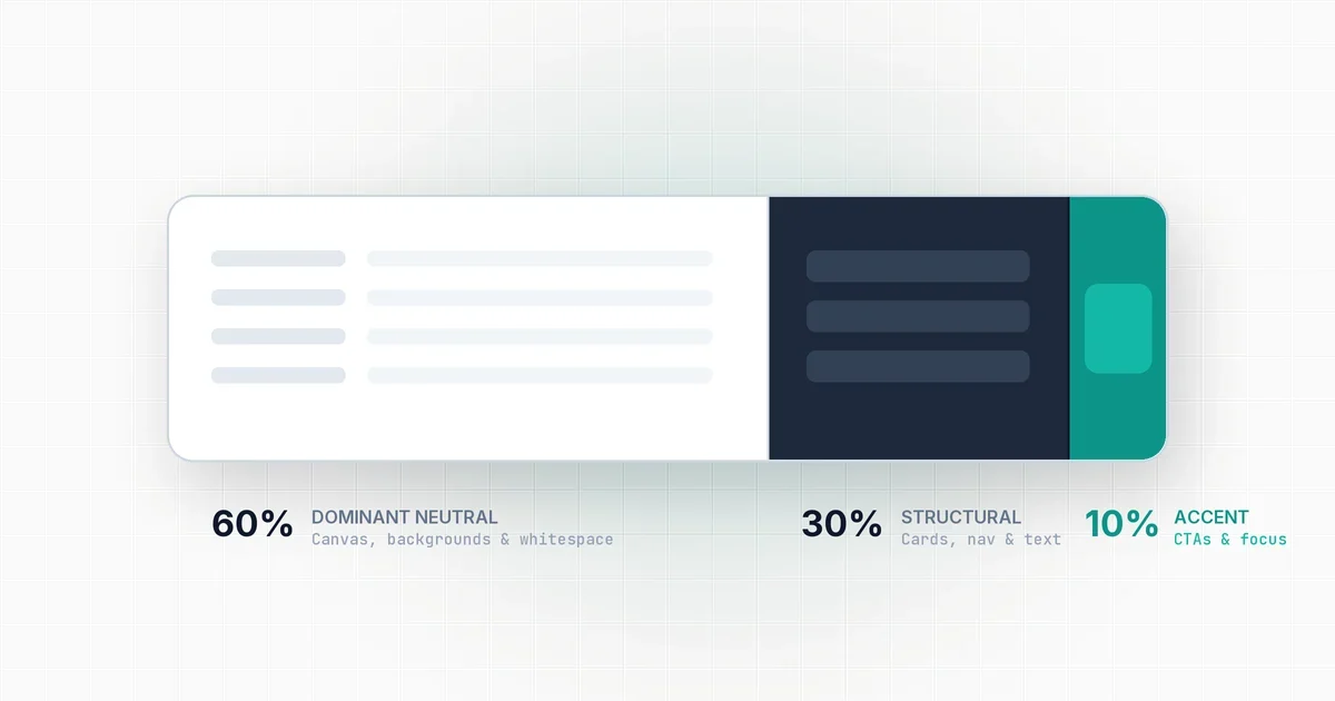
The formula splits your screen surface into three specific tiers:
- 60% Dominant Neutral: Your background canvas, card surfaces, and whitespace.
- 30% Structural Hierarchy: Typography, borders, navigation bars, and table rows.
- 10% Focal Accent: Interactive call-to-action buttons, active tabs, and key status badges.
When you limit your bright brand color to just 10% of the screen, you give it explosive visual weight. A user’s eye lands on a button instantly because it is the only element on the screen wearing that color.
The 60%: Dominant neutral surface
The largest portion of your interface must be quiet. It exists to give your content breathing room.
Never make your 60% dominant surface a bright brand color. If your brand color is blue, making 60% of the page blue turns reading into an exhausting chore.
Instead, use tinted neutrals:
- In light mode: Soft whites, warm creams, or cool light slates (e.g.
#FAFAF9or#F8FAFC). - In dark mode: Deep charcoal, slate, or obsidian (e.g.
#0F172Aor#121212).
By keeping 60% of your screen clean and neutral, your text remains crisp and readable.
The 30%: Structural contrast
The next 30% of your interface gives it structure and legibility.
This tier includes: 1. Body typography: Dark slate text in light mode, or soft off-white text in dark mode. 2. Component surfaces: Secondary card backgrounds, sidebars, and input field backgrounds. 3. Borders and dividers: Subtle 1px lines that separate distinct content blocks.
Your 30% elements must contrast sharply against the 60% neutral surface. In light mode, a #1E293B text color on a #FFFFFF card delivers a crystal-clear 12:1 contrast ratio, easily surpassing accessibility standards.
As we discussed in our guide on how many colors a website needs, your structural colors should handle 90% of the daily reading experience without needing brand decoration.
The 10%: The focal accent
The final 10% is where your primary brand color actually belongs.
This is your visual spark. Use it strictly for elements that require immediate user action or convey critical status:
- Primary action buttons (“Save”, “Deploy”, “Checkout”)
- Active navigation tabs and selected pills
- Important notification dots and badges
- Focused form input borders
If you paint secondary elements with your accent color, you dilute its power. When secondary links, table headers, and sidebar icons all share the accent color, users cannot tell what is clickable and what is static text.
Before deploying your accent color, verify its text contrast using our contrast checker. Text placed on your 10% accent button must hit at least a 4.5:1 ratio to pass WCAG AA requirements.
How to organize the 60-30-10 rule in CSS
Here is how to structure your design tokens in CSS custom properties to enforce the 60-30-10 distribution across your stylesheets:
:root {
  /* 60% - Dominant Neutral Canvas */
  --bg-page: #FAFAF9;
  --bg-surface: #FFFFFF;
  --bg-subtle: #F1F5F9;

  /* 30% - Structural Contrast */
  --text-main: #0F172A;
  --text-muted: #64748B;
  --border-subtle: #E2E8F0;
  --border-strong: #CBD5E1;

  /* 10% - Focal Accent */
  --accent-brand: #0D9488;
  --accent-hover: #0F766E;
  --accent-text: #FFFFFF;
}

/* Applying the proportions */
body {
  background-color: var(--bg-page); /* 60% */
  color: var(--text-main);          /* 30% */
}

.card {
  background: var(--bg-surface);    /* 60% */
  border: 1px solid var(--border-subtle); /* 30% */
}

.btn-primary {
  background: var(--accent-brand);  /* 10% */
  color: var(--accent-text);
}
Treating your colors as proportional roles rather than arbitrary decorations is the single fastest way to turn a chaotic UI into a clean, intentional design system.