How to Build a Complete Color Palette from a Single Hex Code
Learn how to build a production color palette from hex. Generate a 50 to 950 tonal scale, mix brand-tinted neutrals, and verify accessible contrast.
Most design projects start with a single brand color. A client hands you a logo, or you pick one primary shade you love, like #2f6f68. But a single color cannot build an interface. You need dark body text, light card backgrounds, subtle borders, and high-contrast accents.
To build a full color palette from hex right now, you do not need to guess secondary colors by eye. You need three distinct layers: a tonal lightness scale (50 to 950), a tinted neutral gray family, and one contrasting accent.
You can test this instantly: paste your seed hex into the palette generator to create harmonious balance, or generate a 50 to 950 tonal scale in the color converter.
Here is the exact framework to turn one hex code into a complete design system.
How to build a complete color palette from hex
Step 1: Generate your 50 to 950 tonal scale
Your primary hex code usually lands around a 500 or 600 weight. It looks great on a button, but it is too saturated for a page background and too light for body text.
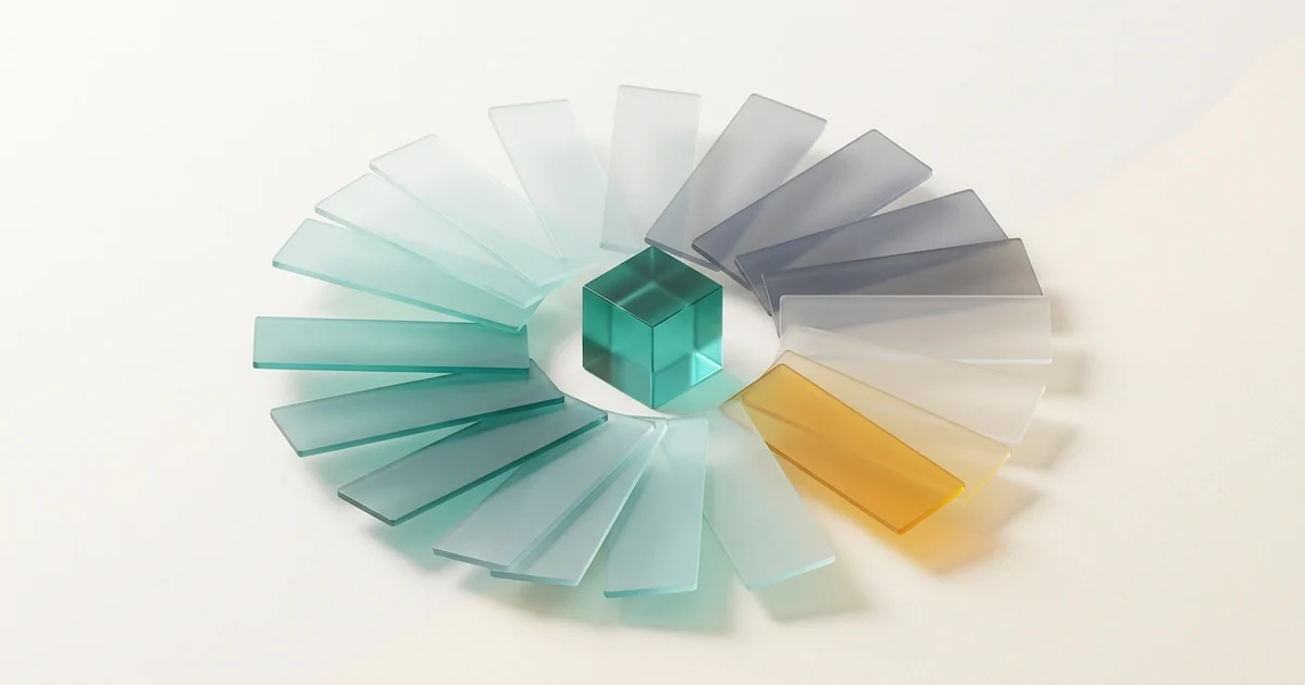
You need a 9-step tonal scale:
- 50 to 100: Subtle tinted backgrounds and hover states.
- 200 to 400: Borders, dividers, and disabled elements.
- 500 to 600: Primary buttons, active tabs, and brand highlights.
- 700 to 950: High-contrast text on light backgrounds.
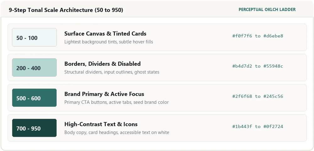
Do not build this scale by adjusting HSL lightness in standard CSS. HSL has a fatal flaw: yellow at 50% lightness looks blindingly bright, while blue at 50% lightness looks dark.
Instead, use perceptual color models like OKLCH. OKLCH keeps perceived brightness uniform across every step. Paste your hex into the color converter to copy a mathematically uniform 50 to 950 ladder.
Step 2: Build tinted neutrals, not pure grays
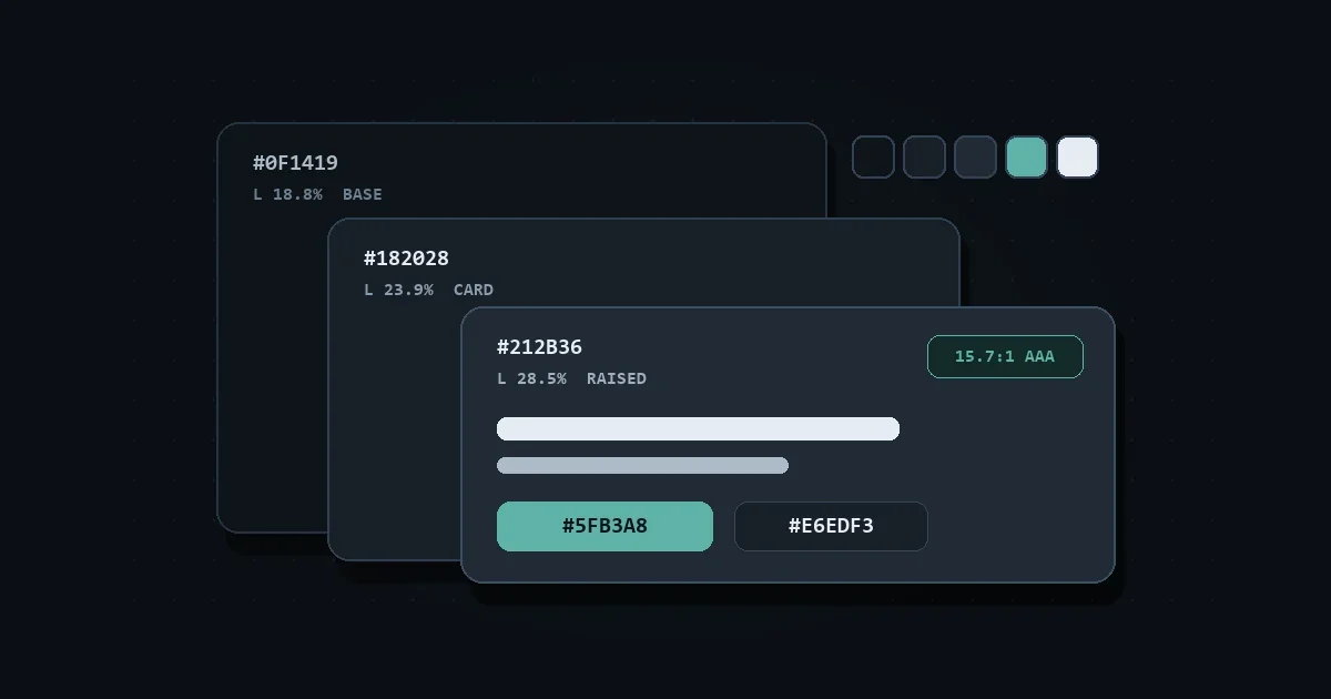
Pure gray (#808080) made from equal parts red, green, and blue feels cold and lifeless on a screen. Modern design systems tint their neutral grays with a tiny pinch of the primary brand hue.
Here is how you do it:
- Take your primary hex color.
- Drop the chroma (saturation) down to roughly 2% to 4%.
- Stretch that desaturated tone across white (
#ffffff) to near-black (#111827).
A blue brand creates slate grays. A teal brand creates cool mist grays. An amber brand creates warm stone grays. This subtle tint makes your cards, borders, and typography feel naturally connected to your primary color.
Step 3: Pick one contrasting accent color
Your brand color does most of the heavy lifting. But you need an accent color for notification badges, sale tags, and call-to-action highlights that must pop off the screen.
The easiest way to find a matching accent is through color wheel harmony:
- Complementary (180 degrees opposite): Delivers maximum visual punch. For a teal seed (
#2f6f68), a warm amber or coral (#f59e0b) creates instant contrast. - Analogous (30 to 45 degrees adjacent): Delivers calm, unified layouts. Great for data visualizations with multiple series.
Test your seed hex in the palette generator to preview these harmony pairings side by side.
Step 4: Verify your text contrast ratios
Before writing CSS variables, check your text combinations against accessibility standards. If text is hard to read, your design fails.
The Web Content Accessibility Guidelines (WCAG) require:
- 4.5:1 contrast ratio for regular body text (under 18pt).
- 3.0:1 contrast ratio for large headings and bold interface icons.
Never assume white text passes on your primary hex code. A mid-tone teal or orange often fails the 4.5:1 minimum on white text.
Run your button and text combinations through the contrast checker. It tests both WCAG 2.2 and APCA scores, and suggests the nearest passing shade if your pair fails.
Complete design token structure
Here is what your final token set looks like in production CSS:
:root {
  /* 1. Primary Brand Scale (from seed #2f6f68) */
  --color-primary-50:  #f0f7f6;
  --color-primary-100: #d6ebe8;
  --color-primary-500: #2f6f68; /* Seed Hex */
  --color-primary-700: #1b443f;
  --color-primary-900: #0f2724;

  /* 2. Tinted Slate Neutrals (Chroma < 0.02) */
  --color-surface-bg:   #fafbfa;
  --color-surface-card: #ffffff;
  --color-border:       #e2e8e7;
  --color-text-muted:   #60706e;
  --color-text-main:    #161f1e;

  /* 3. High-Contrast Accent */
  --color-accent:       #f59e0b;
  --color-accent-text:  #78350f;
}
This structure gives your developers and UI tools everything they need to build entire dashboards, marketing pages, and forms without ever guessing a hex code.
Frequently asked questions
Can I build a good palette from an ugly brand hex?
Yes. If your seed hex is difficult (like neon lime green), use it strictly as an energetic accent. Build your dominant UI surfaces and typography from tinted neutrals and a deeper, darker sibling shade.
How many colors do I actually need in a palette?
Most clean interfaces only need one primary brand hue, one contrasting accent, and a rich family of tinted neutrals (from light canvas to dark text). Restraint prevents visual noise.
Why do my HSL palette colors look washed out?
Standard HSL does not account for human eye sensitivity. The human eye perceives green and yellow as much lighter than blue at the same numeric lightness. Use OKLCH tools to generate scales that feel balanced to real eyes.
Next steps
Generating a complete color palette from hex is simple when you follow a structured framework. Start with your primary seed, build your 50 to 950 scale, tint your neutrals, and verify contrast on the contrast checker before you ship.