Dark Mode Color Palette: Surfaces, Text, and Accents That Work
Pure black (#000000) and pure white (#FFFFFF) strain eyes in dark mode. Use these tested dark surface hex codes, contrast targets, and CSS tokens instead.
Flipping a light interface into dark mode by swapping white for #000000 and black for #FFFFFF looks harsh fast. Shadows vanish, bright links vibrate, and long paragraphs feel tiring to read.
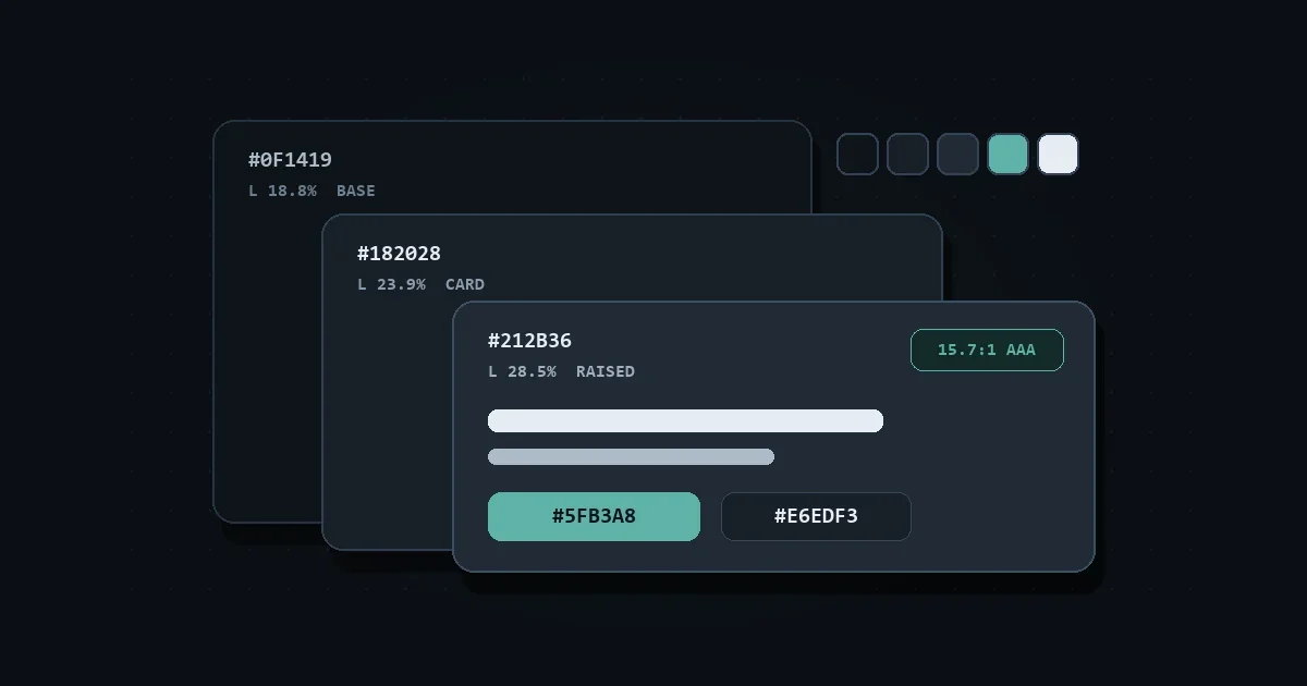
The quick fix is simple: use deep tinted slate like #0F1419 for your base canvas, step cards up to #182028 and #212B36, set body text to soft off-white #E6EDF3, and brighten dark brand accents in OKLCH so they clear 4.5:1 contrast.
You can test every text and background pair against WCAG 2.2 and APCA thresholds in our color contrast checker.
Here is why pure black fails, how to layer dark surfaces cleanly, and the CSS tokens you can ship today.
Why pure black and pure white fail in dark mode
Pure white (#FFFFFF) on pure black (#000000) hits the maximum 21:1 contrast ratio. On glowing screens in dim rooms, bright white letter strokes bleed slightly into the dark pixels around them.
Vision researchers call this effect halation (or irradiation). Readers with astigmatism often see fuzzy halos around thin white letters on pitch black.
Switching to soft off-white #E6EDF3 on deep slate #0F1419 lowers peak glare while keeping a crisp 15.67:1 WCAG ratio and an APCA score of -94.8. You still keep OLED power savings near peak levels without hurting legibility.
How do you build surface layers without shadows?
In light mode, drop shadows separate cards, sidebars, and dropdown menus. On dark backgrounds, black shadows disappear into the canvas, leaving every box flat.
Instead of heavier shadows, step your background lightness up by 4% to 6% in OKLCH for each layer closer to the user. Add a subtle 1px border only where two layers sit next to each other.
| UI Layer | Hex Code | OKLCH Value | Primary Text (#E6EDF3) |
Muted Text (#ADBAC7) |
|---|---|---|---|---|
| Base canvas | #0F1419 |
oklch(18.8% 0.013 249) |
15.67:1 (AAA) |
9.37:1 (AAA) |
| Cards & panels | #182028 |
oklch(23.9% 0.019 249) |
13.93:1 (AAA) |
8.33:1 (AAA) |
| Menus & modals | #212B36 |
oklch(28.5% 0.025 251) |
12.14:1 (AAA) |
7.26:1 (AAA) |
Notice the slight cool tint (chroma around 0.013 to 0.025 at hue 249). Tinted dark grays feel cleaner than flat neutral grays like #1A1A1A.
Watch your muted text on the top layer, too. A gray like #8B949E scores 6.02:1 on the base canvas, yet drops to 4.67:1 on #212B36 and only hits APCA Lc -40.2. Choosing #ADBAC7 keeps muted labels above 7.2:1 and Lc -60 on every layer.
Why do light-mode brand colors fail on dark surfaces?
Brand colors picked for white paper almost always fail dark mode checks. Darker hues lose contrast, while neon accents vibrate against dark slate.
Take two real UI tokens:
- Brand teal #2F6F68: Passes cleanly on #FFFFFF at 5.84:1, but drops to 3.17:1 on #0F1419 and fails WCAG AA.
- Alert red #DC2626: Passes on white at 4.83:1, yet falls to 3.83:1 on #0F1419 and 3.41:1 on cards.
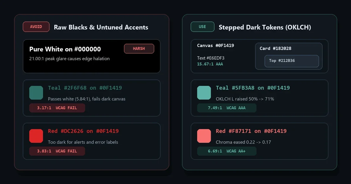
To fix this without ditching your brand hue, paste your hex code into our color converter, keep the hue angle fixed, raise lightness toward 70% in OKLCH, and trim high chroma slightly:
- Tuned dark teal
#5FB3A8: Raises lightness from49.8%to71.1%at hue185, hitting7.49:1on#0F1419(6.66:1on#182028). - Tuned alert red
#F87171: Raises lightness to71.1%and trims chroma from0.215to0.166, hitting6.69:1on#0F1419.
For more detail on why contrast math shifts across different hues, check our WCAG contrast ratio guide.
Dark mode CSS tokens with light-dark()
You don’t need duplicate CSS variable blocks for light and dark themes anymore. Modern browsers support color-scheme: light dark paired with the CSS light-dark() function:
:root {
  color-scheme: light dark;

  --surface-0: light-dark(#fbfaf8, #0f1419);
  --surface-1: light-dark(#ffffff, #182028);
  --surface-2: light-dark(#f3f4f6, #212b36);

  --text-main: light-dark(#1f2933, #e6edf3);
  --text-muted: light-dark(#52606d, #adbac7);
  --accent: light-dark(#2f6f68, #5fb3a8);
  --danger: light-dark(#dc2626, #f87171);
}

body {
  background: var(--surface-0);
  color: var(--text-main);
}
Keep color-scheme: light dark on :root. Without it, light-dark() stays locked to the first (light) value even when the user prefers dark mode.
Dark mode color palette FAQ
Is #121212 better than #000000 for dark mode?
Yes. #121212 (or tinted #0F1419) softens glare against light text and leaves room to make inputs or recessed boxes darker when needed. You can’t make #000000 any darker.
What contrast ratio should dark mode body text have?
Target at least 4.5:1 under WCAG 2.2 AA, and aim for 10:1 to 16:1 for primary body copy. Check thin fonts with APCA too, aiming for Lc 75 or higher on long paragraphs.
Should you avoid pure black everywhere in dark mode?
Not everywhere. Pure black works fine behind full-bleed photos, video players, or small OLED badges. For text-heavy dashboards and articles, deep tinted slate like #0F1419 reads far more comfortably.
Test your own dark surfaces, muted labels, and brand accents side by side in the ToolQuilt color contrast checker.