Linear vs Radial Gradients: How to Direct Visual Flow in Web UI
Linear gradients create motion along an axis, while radial gradients create depth and focus. Here is how to use both effectively in modern web UI.
Gradients are everywhere in modern web design. They power hero section backdrops, subtle button highlights, card border glows, and typography accents across tools like Stripe, Vercel, and Linear.
Used incorrectly, gradients can feel dated, distract from content, or produce ugly gray banding lines across your layout.
The quick design rule is: use linear gradients to guide directional reading flow (like top-to-bottom or left-to-right), and use radial gradients to establish focal depth, spotlight primary actions, or create ambient background glows.
You can generate smooth, multi-stop CSS gradients with our interactive gradient builder.
Here is how linear and radial gradients direct user attention and how to code them cleanly.
1. Linear gradients: Directing motion and reading axis
A linear gradient transitions colors along a straight directional vector. You control it with an angle (135deg) or a direction keyword (to bottom right).
/* Clean 135-degree diagonal card gradient */
.card-header {
  background: linear-gradient(135deg, #1e293b, #0f172a);
}
In UI design, linear gradients work best when they align with the natural scanning pattern of your interface:
- Left-to-right (to right): Natural for progress bars, timeline cards, and headline text clips where the reader’s eye naturally sweeps from left to right.
- Top-to-bottom (to bottom): Ideal for page sections, cards, and dropdown containers. Placing the lighter tint at the top mimics natural overhead daylight, giving containers subtle physical realism.
- Diagonal (135deg): The standard modern angle for call-to-action buttons. It creates visual momentum from the top-left toward the bottom-right action corner.
2. Radial gradients: Creating depth and spotlight focus
A radial gradient radiates outward from a single focal origin point, expanding in a circle or ellipse.
/* Ambient top-center spotlight behind a hero headline */
.hero-glow {
  background: radial-gradient(
    circle at 50% 0%,
    rgba(56, 189, 248, 0.15) 0%,
    transparent 70%
  );
}
Radial gradients are the secret behind modern dark-mode software aesthetics:
- Hero spotlights: A large, soft radial gradient (with 10% opacity) placed at 50% 0% creates an ambient light cone behind your main headline. It separates the text from a flat black background without adding clutter.
- Hover spotlights on cards: Many modern component libraries track the mouse cursor and place a radial gradient at the pointer’s coordinates, creating an interactive glassmorphic sheen as the user hovers over the card.
How to avoid the gray dead zone in gradients
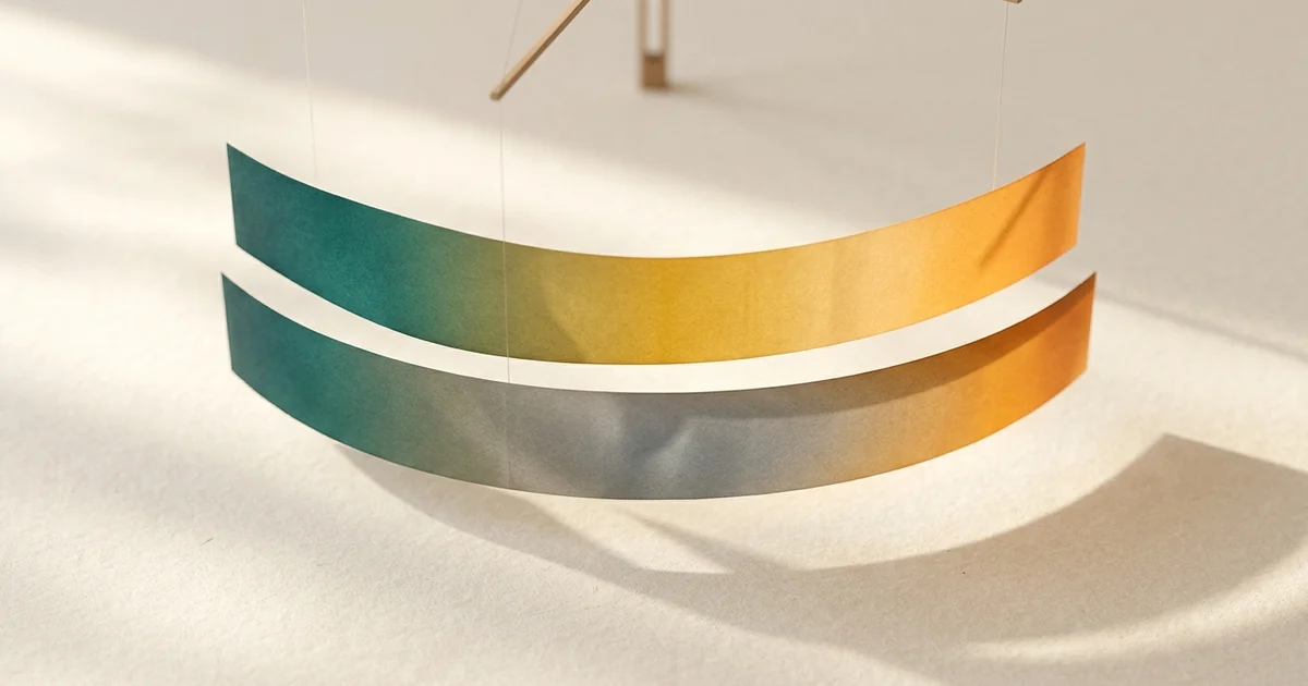
When you blend two complementary colors in standard CSS (like teal to warm amber), the midpoint often turns into a muddy, washed-out gray stripe.
This happens because standard CSS interpolates gradients in the legacy sRGB color space, passing directly through the desaturated gray core of the color cube.
To fix this in modern CSS, specify the interpolation color space:
/* Legacy sRGB: Produces a muddy gray band in the center */
background: linear-gradient(to right, #2f6f68, #f2b134);

/* Modern OKLAB: Maintains vivid saturation throughout the transition */
background: linear-gradient(in oklab to right, #2f6f68, #f2b134);
For a visual breakdown of why this happens and how browser engines compute color transitions, read our guide to fixing gradient gray bands with OKLAB.
Best practices for production UI
- Keep contrast subtle: High-contrast gradients (like neon magenta directly into lime green) overwhelm users. Limit contrast by shifting hue by only 20 to 40 degrees, or shifting lightness while keeping the hue constant.
- Use easing: Gradients that jump abruptly from one color to another look harsh. Add intermediate color stops at 30% and 70% to produce smooth easing curves.
To build custom linear, radial, and multi-stop color transitions with clean CSS code output, use the ToolQuilt gradient builder.