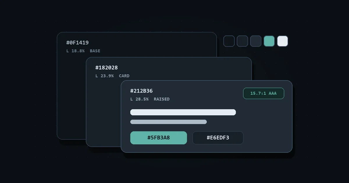
Dark Mode Color Palette: Surfaces, Text, and Accents That Work
Pure black (#000000) and pure white (#FFFFFF) strain eyes in dark mode. Use these tested dark surface hex codes, contrast targets, and CSS tokens instead.
Color theory, WCAG contrast, color spaces such as OKLCH, and turning a palette into a color system you can ship: the ideas behind the color tools, explained plainly.
14 articles
Pure black (#000000) and pure white (#FFFFFF) strain eyes in dark mode. Use these tested dark surface hex codes, contrast targets, and CSS tokens instead.
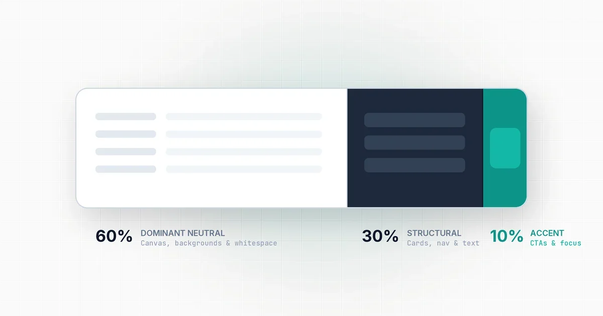
Most interfaces look chaotic because brand color covers too much screen space. Here is how to use the 60-30-10 distribution rule to create visual balance.

Linear gradients create motion along an axis, while radial gradients create depth and focus. Here is how to use both effectively in modern web UI.

Hard-coded hex codes make dynamic theming and tinting painful in CSS. Here is why modern design systems use functional colors like HSL and OKLCH.

Why do bright digital hex colors turn dull and muddy when printed? Learn how additive and subtractive gamuts work and how to convert colors without ugly shifts.

WCAG 2.1 contrast math has a major blind spot: it ignores font weight and treats dark mode identically to light mode. Here is how APCA fixes text readability.

Learn how to build a production color palette from hex. Generate a 50 to 950 tonal scale, mix brand-tinted neutrals, and verify accessible contrast.

Blue is cool and red is warm, except that physically it is the exact reverse, and the associations are less universal than the design textbooks suggest.

Roughly one man in twelve does not see your palette the way you do. The fix is not a beige interface. It is making sure color is never the only thing carrying the message.